
Design Conventions
Sometimes the person tasked with the web design phase finds themselves without a proper style guide, appropriate existing layouts, or explicit layout requirements.
Non-traditional, experimental design can be wonderful, exciting, and rewarding. However, you also have to contend with deadlines, client expectations, and users who just want to find out what time the library closes, goshdarnit.
It's at this point that a web designer (or someone pretending to be a web designer) asks - what is the normal thing to do?
As a rule, users are best served by designs and layouts that are intuitive - meaning that they can easily recognize interactive elements, and where to find the information they're looking for.
Most of these conventions are not just tried-and-true, they're based on a simple principle: people scan site content in a particular order.
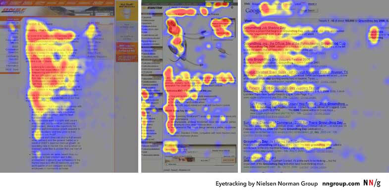
People will scan your website starting in the corner where they would start reading a page of text. They continue scanning from the initial side, going less and less far across the page the further down they go. This is know as the 'F-Pattern'.
Remember that not all people read from left to right! Readers of Arabic, Hebrew, Pashto, Persian, Urdu, and Sindhi read horizontally right to left, and readers of Chinese, Japanese and Korean scripts read vertically from right to left. Know your audience.
Put the logo in the top left
, and make it a link to the home page.
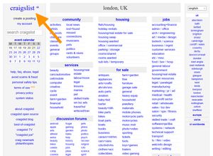
Put the navigation prominently in the header
.Put important actions in the top right
.

Stick to the grid
. Using a grid to guide your content placement creates a consistent, predictable experience.

-
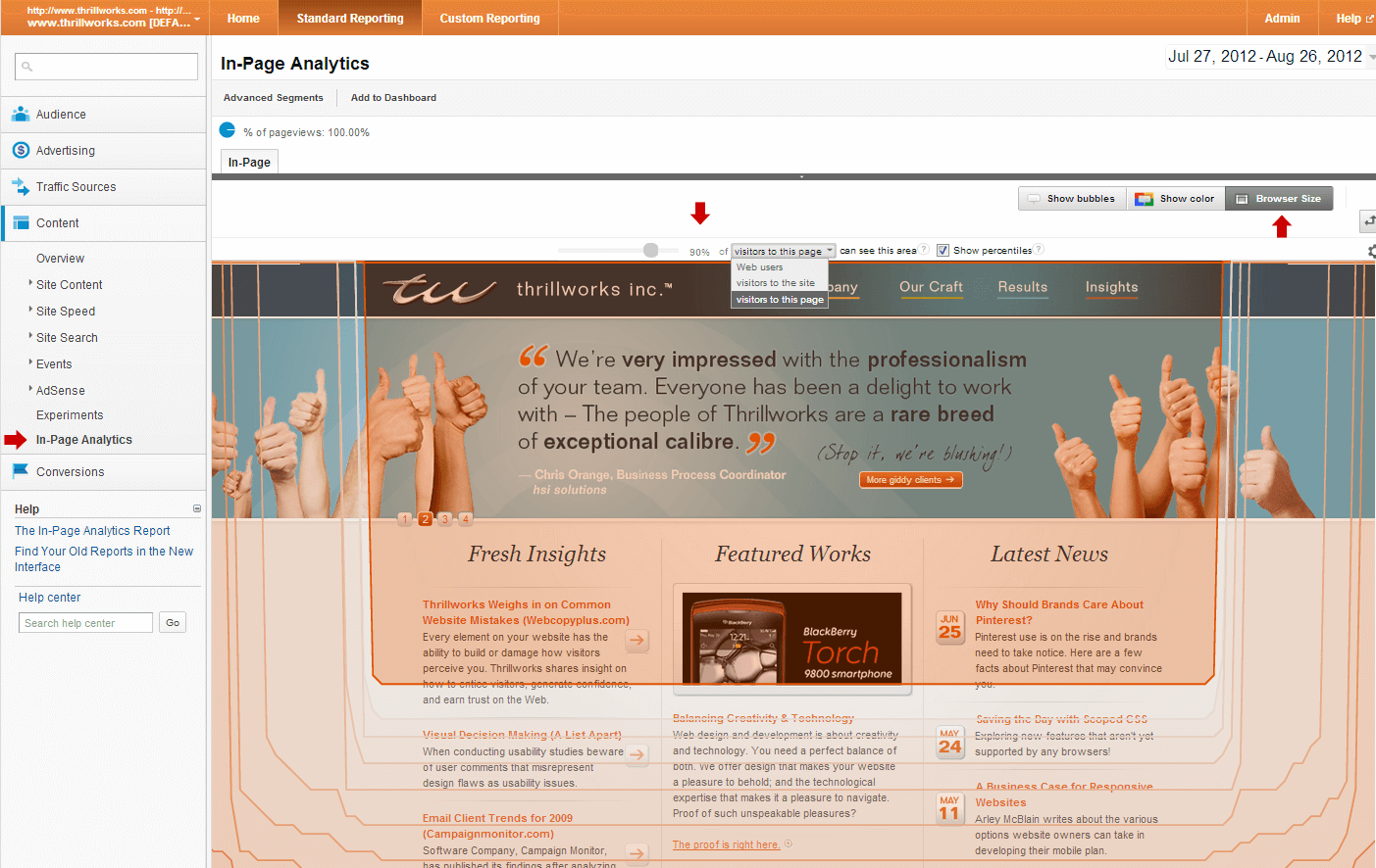
Prioritize content in highly‑read areas
. One guide for this could be the F-pattern we discussed earlier. Another high-priority pattern is choosing what content should be "above the fold".This is a term that dates back to newprint - top headlines were kept in the top half of the page, above where the newspaper would be folded in half horizontally. In the early days of the web, people did not scroll web pages. Like, at all, basically.
This has changed... somewhat.
In 2010, 80% of the viewing time was spent above the fold. Today, that number is only 57%.
Add to that the fact that responsive design means there is no exact spot where the "fold" will be for users. Nonetheless, it's a good rule to follow that the higher up the content is, the better the chance users will actually see it.
Boring stuff goes in the footer
. Sitemaps, contact forms, social media links, copyright - all the stuff the client requires but no user would ever actually need.

Those are the big ones! Web design truisms that you can hang your hat on. Of course, there are all kinds of smaller conventions that we can take for granted (☰ hamburger menu, anyone?), but these 6 standard approaches to page design are enough to get you started.
- Visual Hierarchy: Organizing content to follow natural eye movement patterns Opens in a new window, Interaction Design Foundation
- F-Shaped Pattern of Reading on the Web: Misunderstood, But Still Relevant (Even on Mobile) Opens in a new window, Norman Nielsen Group
- Building Better UI Designs With Layout Grids Opens in a new window, Smashing Magazine
- Scrolling and Attention Opens in a new window, Norman Nielsen Group
- Responsive Web Above The Fold Opens in a new window, CSS Tricks